Article:
Inspired by the client’s collection of classic cars, i-Ten Designs has mixed glamor with modern functionality to create a dream home.
BY CAITLIN WHEELER | PHOTOS COURTESY OF AYTEN NADEAU/AURA MARZOUK PHOTOGRAPHY
Maria and Mike Zeinstra spent years looking for a mid‑century modern house close to downtown Raleigh with space for themselves and their three collies. The challenge: They also needed to accommodate their collection of classic “muscle” cars, including a ’66 Pontiac LeMans and a ’78 Trans Am. Oh, and a 1972 LeMans Wagon, “for the dogs.” Maria explains, “It’s the only one they all fit in.”
When their realtor called in 2020 with another listing, Maria, unimpressed with the online photos, reluctantly drove out to the house. Built in the early nineties and never updated, it had cramped rooms and an awkward layout. “It was ugly, and there was an awful smell,” says Maria.
The house did, however, have two advantages: First, though close to town, it sat on 3.4 acres of grassy, wooded land, and second, in addition to an attached three-car garage, it had a stand-alone five-car garage. “I knew immediately,” says Maria. She called Mike and told him he had to hurry over; she’d found their house.
The couple, married now for 15 years, originally connected over a passion for hiking and the outdoors, and this bucolic property struck a nerve. “It just felt like the most perfect campsite you could imagine,” says Maria. But it was car love that sealed the deal. More than terrific-looking modes of transportation, cars are a key part of the Zeinstras’ identity: They attend enthusiast meet-ups, “cruise-ins,” and monthly “cars and coffee” events. “This community is one of the best things about North Carolina,” Maria says.
Absolutely sold on the property and its car capacity, the couple faced the challenge of the house itself. So, after calling Mike that first day, Maria called her friend, Ayten Nadeau, founder and lead designer at i-Ten Designs.
“Ayten is sophisticated and stylish, and she knew our cars and understood our vision,” says Maria. Nadeau draws on an eclectic background for her design smarts, including a rural childhood in Turkey and Germany, over 25 years of international travel as a flight attendant, a BFA in design, summer workshops at Harvard and Oxford Universities, and an apprenticeship to a Raleigh architect.
Embracing the Zeinstras’ passion for mid-century modern (MCM) design, Nadeau used MCM principles to solve the challenges presented by the rundown home.
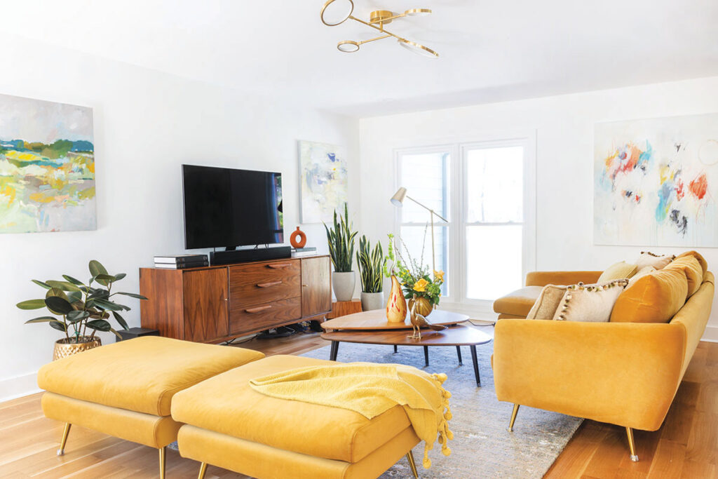
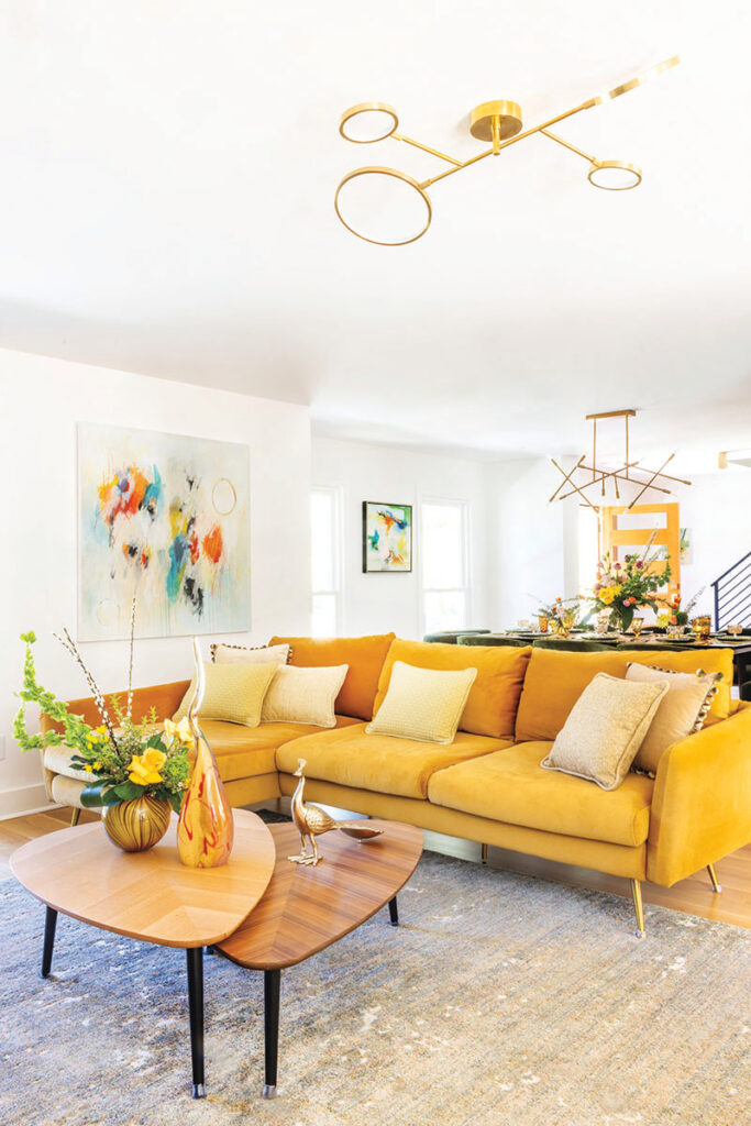
ABOVE: The gold chandelier, reminiscent of 1950s “futuristic” themes, draws the eye upward, making the living room ceiling feel higher.
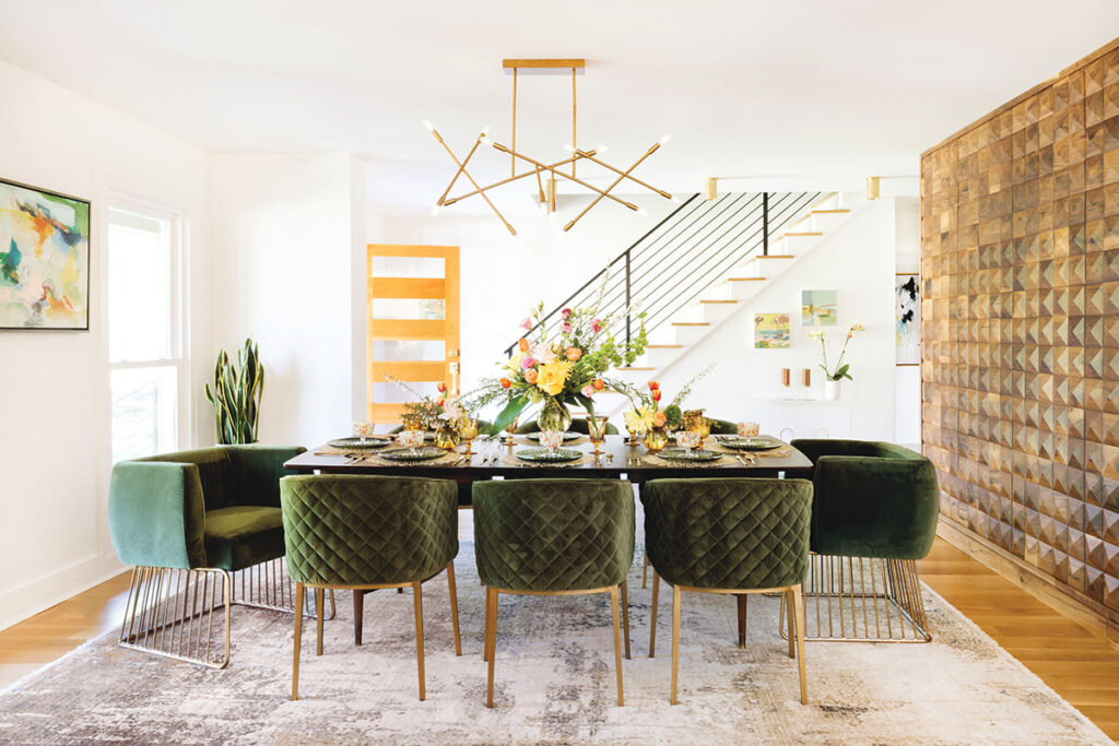
The 3D, walnut-finished wall in the dining room contrasts with the room’s surrounding all-white walls and ceiling, bringing the space to life. It is just one side of a multipurpose room divider.
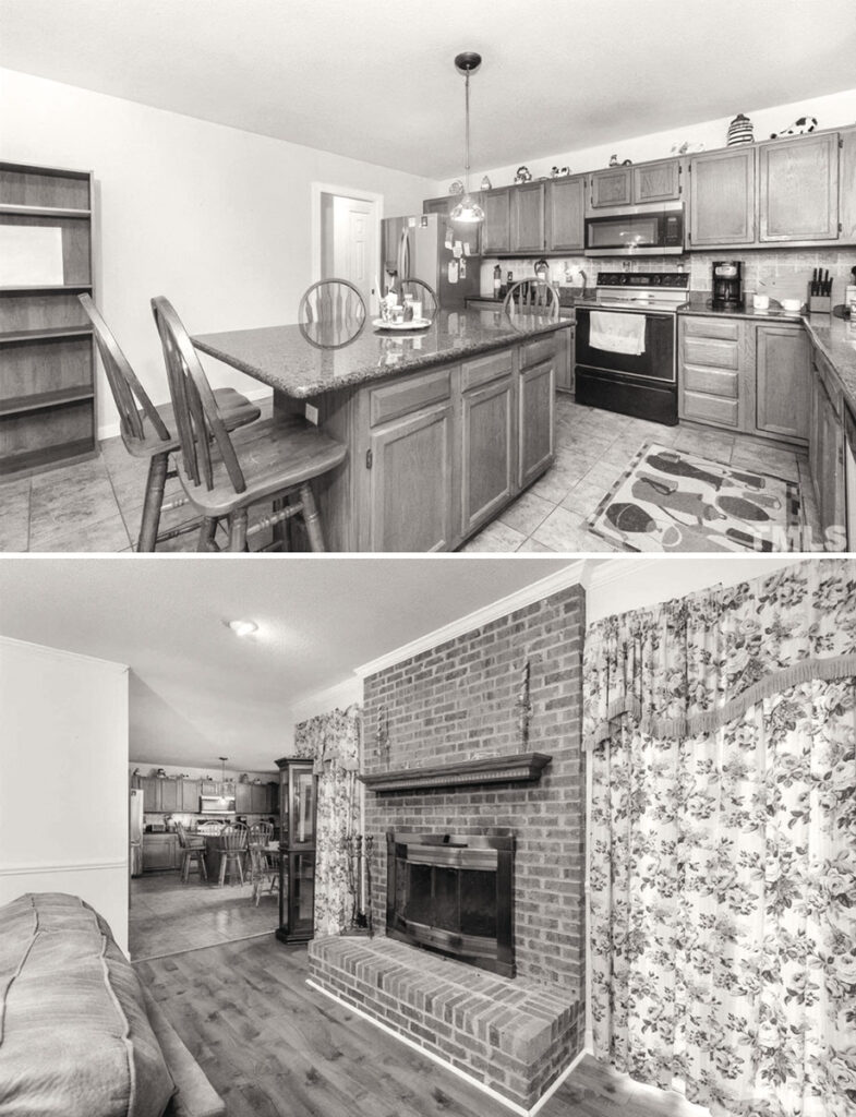
The kitchen in the Zeinstras’ home before the renovation. Designer Ayten Nadeau removed the walls that were blocking light and updated the kitchen’s style and color scheme.
The living room before the renovation.
Design Challenge: Dark and Cramped
MCM’s Solution: Open Concept, Bring the Outside In
To reduce waste, the Zeinstras wanted to renovate rather than rebuild, though they all agreed the downstairs had to be gutted. “The layout was absurd,” says Nadeau. “The rooms were dim, awkward and disconnected.”
Her revised floorplan is “open‑concept,” a signature MCM style. By removing walls that blocked off the living, dining and kitchen areas, Nadeau allowed natural light to penetrate the entire area, creating a bright and spacious main living space. “Instead of walking into a wall, you feel immediately welcomed into the heart of the home,” says Nadeau.
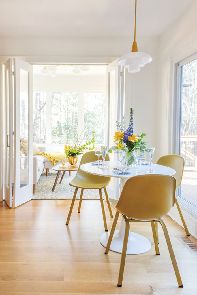
Nadeau also followed the MCM style of “bringing the outdoors inside.” First, to counter the home’s north-facing façade, which limited natural light, she added five exterior windows. The new windows open the home to the property and let the sunshine pour in. Maria says the breakfast nook and adjacent sunroom are especially “happy and light-filled” spots where she drinks her morning coffee and feels at once calm and revitalized.
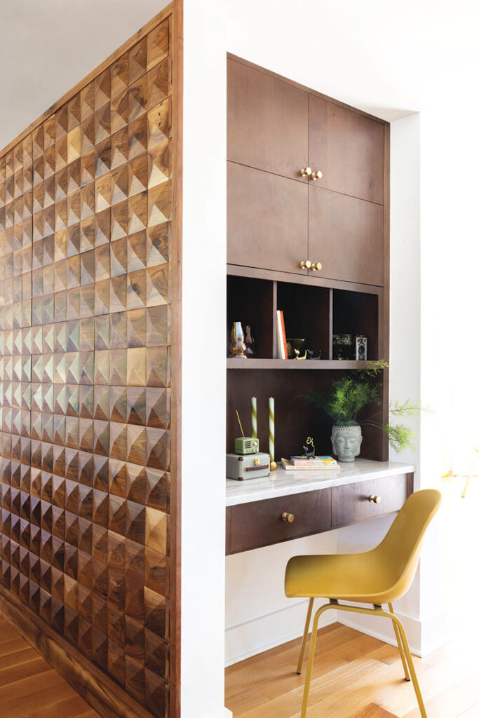
Multifunctional design, another MCM hallmark, inspired the wall divider in the great room. It not only creates subtle separation between zones, but it also provides a use suited to each side: on the kitchen side a walk-in pantry, on the mudroom side a built-in desk, and on the hall side a coat closet.
Design Challenge: Maximize Eight-Foot Ceiling
MCM Solution: Clean Lines, Simple Colors
The home’s eight-foot ceiling could not be raised during the renovation, and Maria wanted to make it feel higher. “It’s not hard to trick the eye,” says Nadeau. “People tend to forget about ceiling design strategy.”
Nadeau streamlined the space, avoiding molding at the ceiling or framing around the windows. Then she painted everything—floorboards, walls and ceilings—the same shade of white to create an uninterrupted blank canvas. The furniture, low-slung per MCM style, further opens the canvas.
To draw attention upwards, she installed modern lighting, upward-facing wall sconces, and “canned lights everywhere.” She finished the ceiling with a slight gloss to reflect and amplify light. Finally, she added high-drama chandeliers in the living room and above the dining table. Both are polished gold—attention-grabbing riffs on the “Sputnik” style popular during the retro‑futuristic fervor of the 1950s.
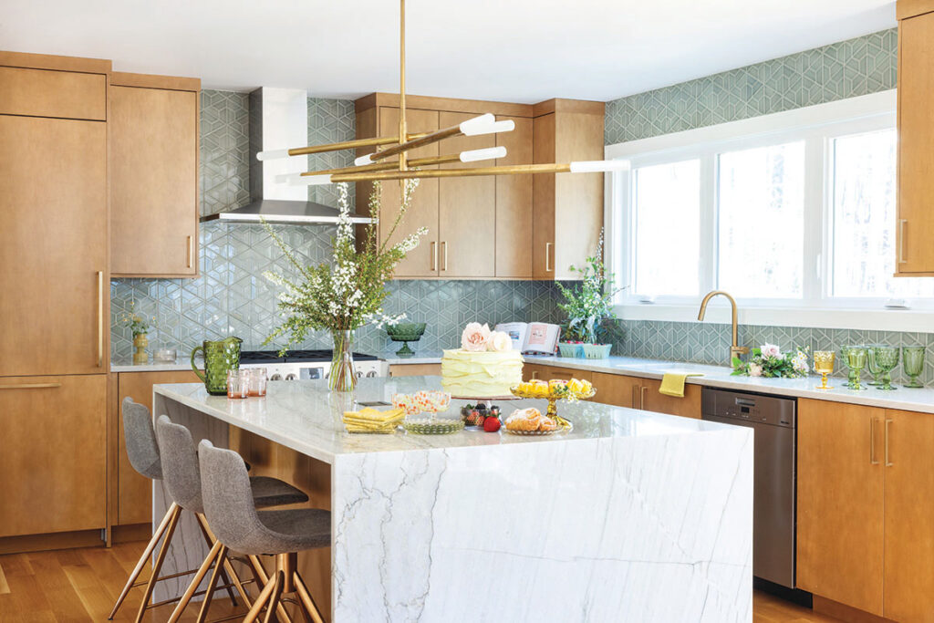
ABOVE: The Zeinstras’ kitchen after the renovaton. The tile backsplash is very MCM in style.
The simplicity of the classic tulip table and plastic Eames chairs in the breakfast nook blend right into the woodsy garden, bringing the outdoors in.
The wall divider includes a simple built-in desk, its vertical reach providing nice visual contrast. Dark walnut wood was a popular choice for furniture designers in the 1950s.
Design Challenge: Lacking Visual Interest
MCM Solution: Dramatic Accents
“It’s crucial that each space have some dramatic focal grounding,” says Nadeau. So, after unifying and brightening the home with a minimal, all-white look, Nadeau went “really big” on a few concepts.
She chose fun MCM pendant lights, chandeliers and sconces—not just for the dining and living rooms, but for the kitchen, the bathrooms, and even the oversized walk-in closet. To add excitement without overwhelming, Nadeau incorporated “moments of color” with select pieces of vibrant-hued furniture and distinctive art. “We wanted unique, original art by local artists,” says Nadeau, who perused Raleigh galleries looking for works with nature-inspired colorways: greens, golds and subtle browns.
The largest original art pieces are Nadeau’s beloved accent walls. Since bathrooms offer a small, safe place to “go bold,” each one features an accent wall in dramatic Italian tile.
The 3D wall in the dining room is the most eye-catching of all, the dark walnut finish striking against the bright white of the surrounding walls. “The wood, with its texture and natural inconsistencies, looks like the bark of a tree or a forest streambed,” says Nadeau. “It brings movement and life to the room.”
Nadeau added drama in the kitchen by juxtaposing MCM with contemporary design. Along with the simple wood cabinets and tile backsplash of an MCM kitchen, it has a modern marble waterfall island, sleek stainless steel appliances and a glamorous chandelier.
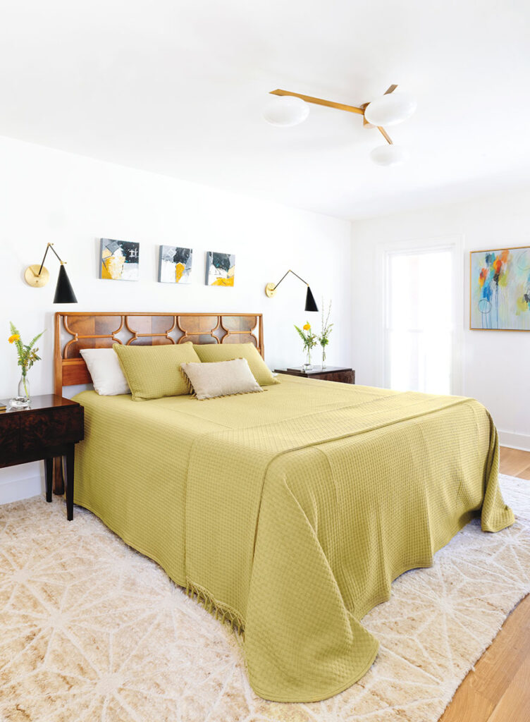
ABOVE: The master bedroom. Note the retro geometric shades on the wall-mounted bedside lamps.
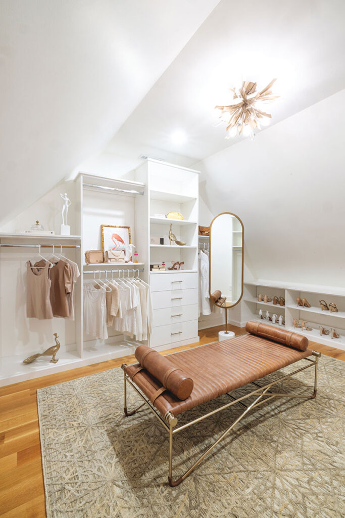
The walk-in closet has a minimalist vibe and a natural, rosy glow. The gold peacock statues and chandelier add art deco glamour, while the leather daybed bench is pure MCM.
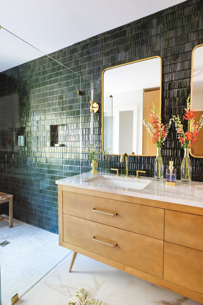
The master bath leans contemporary, with its floating vanity and glass shower enclosure. The accent walls of slick green tile hint at both a wild jungle and chic spa.
Design Challenge: Dogs
MCM Solution: Minimalism
Throughout the renovation, Nadeau thought about the three large “double-coated” collies that would be living there. “They couldn’t possibly have more hair,” says Maria
with a laugh.
To make sure the dogs were comfortable and the house was protected, Nadeau stuck with minimalism, plenty of open space and open floors. By drawing the eye upward to the wall art and light fixtures, she negated the need for dog-level extras. “With the dogs in mind, we chose natural hardwood floors that would be easy to clean and refinish,” says Nadeau.
Maria and Mike love the minimalist look, and have made a conscious effort to maintain it. They moved in with few possessions, and Nadeau established a designated place for each item they do have. “When the house is clean, it gives off positive chi, and we just breathe a little easier,” says Maria. “We’ve noticed that even the dogs seem calmer in the new house. We love it.”


