Article:
BY CAITLIN WHEELER | PHOTOS BY DUSTIN PECK PHOTOGRAPHY
James Hardy has advised clients on fine interior design since well before he and his wife, Margeurite (“Mig”), moved back to Raleigh from Charlotte in 2016. “Jim is an incredibly gifted interior designer,” says Raleigh-based architectural designer Carter Skinner, renowned for his own sense of elegant Southern style.
But Jim-the-designer also happens to be Dr. James Hardy, M.D.—an obstetrician of nearly 40 years recruited to Raleigh’s UNC REX hospital, where he currently works as a lead hospitalist. “Design has always been a part of who I am,” he says. “If I’d had any role models in that field growing up, I probably would have been an architect.”
Maybe it’s just as well, as Jim has no regrets about his career in medicine. Besides, his Raleigh home stands testament to his interior design expertise and magnificent art collection, allowing him to enjoy the fruits of both professions.
RECREATING HIGH CHARACTER
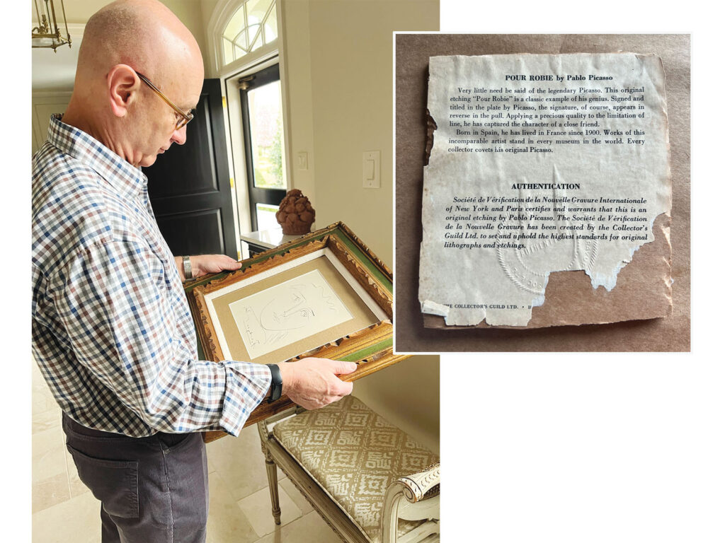
Hardy—the doctor with the designer’s eye—and his equally discerning wife, Mig, arrived in Raleigh with a showstopping collection of fine art and antique furniture. From a sketch by Pablo Picasso to selected pottery by Asheville-based potter Alex Matisse (the great grandson of Picasso’s rival, Henri Matisse), the Hardys’ collection was worthy of a grand display.
So, when the couple started looking for a home in 2016, they prioritized choosing a style that would showcase their art. “We like traditional design freshened with modern updates,” Jim says. “From the start, we knew we wanted an 18th century French-European style that also conveyed a clean, contemporary vibe.”
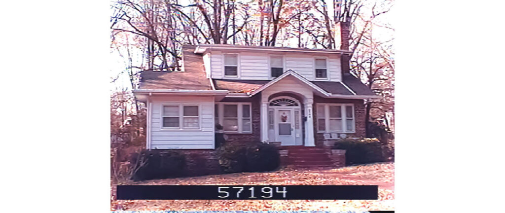
They found a home ripe for renovation in Raleigh’s Anderson Heights neighborhood, within walking distance of Five Points and just a few blocks away from Mig’s childhood home. Originally built in 1923 as a one-and-a-half-story brick bungalow, the home would have been “in the boonies” at the time, according to Jane Worley of Hodge & Kittrell Sotheby’s International Realty. Worley helped Jim and Mig find the home.
But along with the city, Anderson Heights thrived, and in 2016 the Hardys felt fortunate to find it was available. No longer an unassuming bungalow, the structure had been completely renovated in 2000 to include a full second floor, large hipped roof, and new facade featuring larger windows and a substantial front patio enclosed by a low, lattice-brick wall. “It was not in the best shape, but we liked the dimensions of it,” Jim says. “It had 10-foot ceilings and nice, spacious living areas.” Plus, the Hardys “really loved the neighborhood,” Worley says.
“Lochmore [Drive] is filled with beautiful, old, high-character homes. This was not one of those,” notes John Sanders of John C. Sanders & Company, a style-setting homebuilder in Raleigh who viewed the home with Jim before the Hardys made their purchase.
“It was not pretty,” confirms Skinner. But he agreed that the home “had great potential.” When he stood staring at the house with Jim and Sanders, they had what Jim calls “a true meeting of the minds.”
“From day one, we all knew what we had to do to realize Jim’s vision,” Skinner says. “It was just a matter of implementing and coordinating.
FRENCH CURB APPEAL
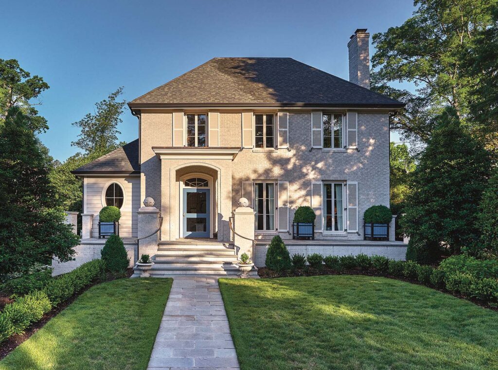
Sanders assembled a team of Raleigh experts who promptly got to work. Jim took on the role of interior designer and consultant on all aspects of the design—from exterior elements to the garden hardscaping and plant selections. They set out to capture French-inspired elegance, which required reworking the facade. “The steep, hipped roof epitomizes the European style, so we just needed to get the rest to match,” Sanders says.
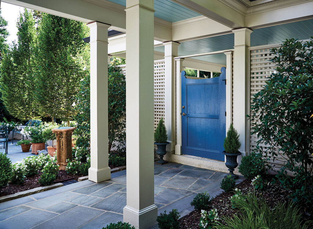
They replaced the existing double-hung windows with taller and slightly narrower casement windows, then removed the sidelights and wide fanlight over the door. They emphasized height by adding a formal portico in a classical style.
As Sanders notes, the new vertical orientation lifts the once “squatty-looking” home so “everything looks tall.” By adding a generous application of mortar, the team evened the joints so the bricks sat flush, then painted the smooth surface in a sophisticated neutral color to match the shutters.
They did away with the brick—both the latticework and wide front stoop—and replaced it with a borderless blue-stone terrace. To further emphasize the new formality, the design team shifted the front walk to the left so it would lead directly from the sidewalk to the front door.
Landscape architect Frank Liggett of Liggett Design Group in Raleigh, one of the first to be invited to join the design team, said the existing garden lacked stylistic purpose and clarity—all overgrown shrubs and unkempt lawn; no trees that might have provided shade and structure. “The garden is an essential element of the whole ‘idea’ of a house,” Liggett says.
To create the European-style garden Jim envisioned, Liggett incorporated hedges and geometric plant arrangements to achieve “a classic or timeless quality” and “an architectural feel. … Plants are not just used as decoration,” he says, “but to create space, control view and to enhance the spaces within the garden.” Now, tall, neat rows of holly guard the front yard, while the graded lawn features a low border of manicured boxwood—a plant strongly associated with formal European gardens.
Keeping in mind Jim’s wide-ranging art collection from various centuries and global regions, the Sanders-Liggett-Skinner design team captured a fresh and subtly contemporary vibe with French/European curb appeal.
The facade’s color, geometric uniformity and true-to-period windows present a clean, new look. The tall and narrow windows feature large, modern glass panes, whereas a traditional French window or door would include at least double the number of panes. At the same time, the off-centered door adds a jauntiness compared with a more traditional and imposing centered entry. Jim’s oversized planters in French blue add a cheerful dash of color and hint of casual French country flair.
FRAMING SIGHTLINES
Skinner approached the interior architecture redesign with a similar mentality, marrying sophistication with livable simplicity. “The existing home had a really bad flow between living areas,” Skinner says. “There were lots of dead ends, so our focus was on opening up the flow.”
He created multiple entryways between closed-off rooms to establish a more natural, accessible plan—important to not only ease the flow of traffic, but to provide sightlines to the art, furniture and window views. Skinner also cased existing openings by enlarging them and creating more formal and attractive framing around them.
“The ‘open-plan’ concept, which has been so popular in modern homes, does not necessarily lend itself to vantage points for displaying art,” Skinner says. “We wanted designated areas to highlight the Hardys’ terrific collection.”
His plan revolved around specific art pieces.
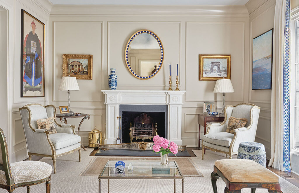
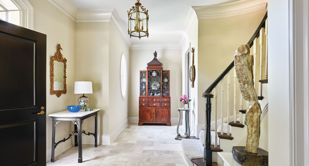
Thus, he and the team rebuilt the main staircase in the entryway to highlight a marble sculpture by a current California artist. They created chateau-worthy paneling in the formal living room for a Guy Carleton Wiggins painting of Washington Square, a large painting of a Chinese warrior and a slightly impressionistic watercolor seascape. The Picasso etching and a Eugene Boudin landscape get pride of place in specially designated front-hall spots.
Two of Jim’s favorite pieces suggest the breadth of his taste. The first is an 18th century Chinese Chippendale bookcase, also on display in the front hall. “It is a little unusual,” he says, “but I’ve always loved it.” And on the modern side, he is delighted with a recently acquired contemporary painting by Herb Jackson. “The two couldn’t be more different,” he notes, “but I love that they can both be in same room.”
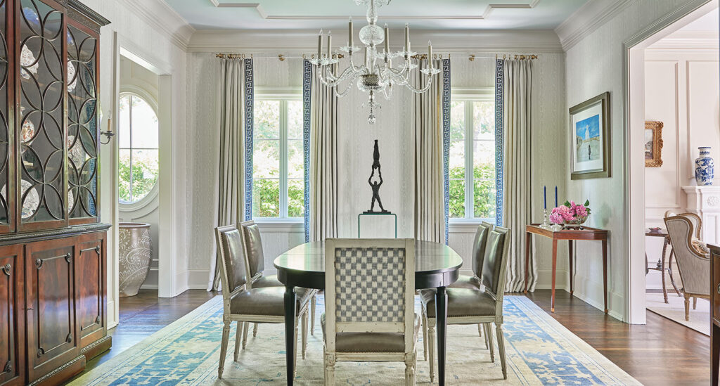
Throughout the house, Jim and Mig chose a quieter color palette, relying on neutral tones for the walls and carpets, with minimal color. The subtle backdrop balances some of the more ornate antique furniture pieces and adds to the serene, contemporary ambience.
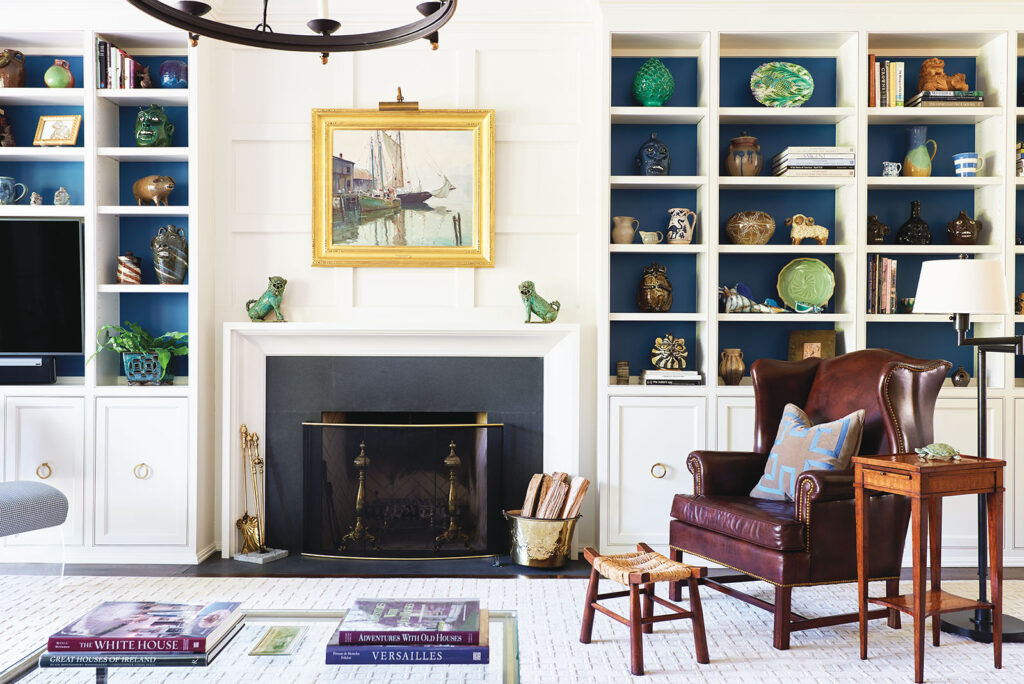
Beyond the front hall and formal living room, the art and rooms become increasingly informal. These “everyday” spaces start with the den—which features blue-lined shelves built for displaying Jim’s collection of North Carolina pottery—and continue to the open kitchen/breakfast/living area, which showcases enormous windows and French doors that open onto the small back patio and garden.
Landscape designer Amy Strunk of Chapel Hill–based Amy Strunk Designs, recently joined the team to create more backyard privacy for the Hardys. She planted a wall of European hornbeams across the back and an espaliered magnolia along a lattice to create additional seclusion. “That garden is a beautifully intimate space,” she says.
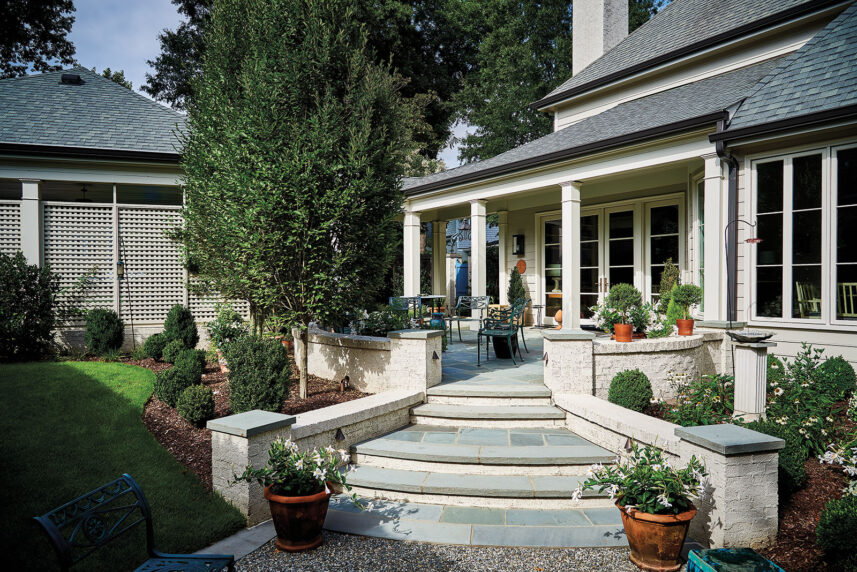
Jim also requested more flowering plants, so Strunk added daphne, camellias, gardenias and climbing roses alongside the bluestone terrace. “We also chose sweet osmanthus, or tea olive,” Strunk says. “It has a great, sweet smell, like cotton candy, which is really nice in a small space like this.”
Jim’s favorite spot in the house is the breakfast table, where he can sit comfortably beside the large windows and gaze out, with a feeling of being right in the middle of nature. “The house and garden really speak to each other,” he says. The front garden is precise and geometric. In back, the smaller, lusher garden complements the home’s informal living areas.
Not much remains of the original 1920s bungalow. Thoroughly renovated over the years before the Hardys bought it, the previous structure exists only in the home’s deepest bones. In a singular nod to its former style, the renovation team added a smaller and simpler fanlight above the front door. “If a house has a soul,” Worley says, “this one is probably very happy in its current iteration.”
Check out more articles from around town at midtownmag.com.
