Article:
Reviving Warmth: A Wakefalls Home
To create spaces that feel both intimate and personal, interior designers like Cheryl Bafford are asking, “How can we bring warmth into the home?”
BY KRISTEN SCHRUM | PHOTOS COURTESY OF ABIGAIL JACKSON PHOTOGRAPHY
Home interior trends are constantly evolving to mirror contemporary preferences, technological progress, and crucially, shifts in lifestyle. The desires and necessities of families drive emerging patterns. A notable example of this tendency has occurred during the post-COVID-19 era, during which interior design has undergone a significant transformation. Trends have shifted from creating ethereal, light and predominantly white spaces to designing textured interiors that are rich in color and exude a sense of warmth, reflecting a change in living space priorities and aesthetics.
In the realm of interior design, the creative vision of Cheryl Bafford from Cheryl Bafford Interior Design, a Chapel Hill–based interior design group, continues to uphold evolving trends, marrying functionality with aesthetic appeal. Bafford’s meticulous design of a Wakefalls neighborhood home in Raleigh blends a French country aesthetic with modern sensibilities. The space showcases the latest design trends while speaking to the soul’s desire for a nurturing environment—one that feels both welcoming and lived-in.
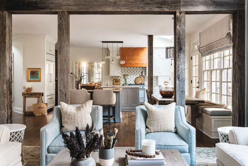
The heart of the Wakefalls home is a well-functioning, light and airy kitchen that exudes rustic charm. Here, Bafford blends a quaint French country style with refined elegance, creating a timeless look that invokes culinary adventures and family gatherings. The kitchen is an emblem of versatility, equipped with a walk-in pantry and diverse islands that cater to the dynamic rhythms of modern living. The La Cornue CornuFé series stove becomes a striking focal point, surrounded by the intricate textures of Venetian plaster that add layers of history and artistry to the design.
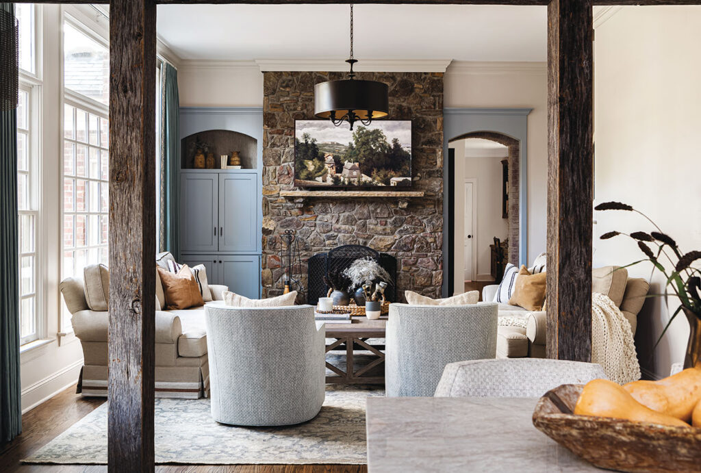

ABOVE : The living room is a study in harmonious contrasts, blending rustic charm with refined elegance. The stone fireplace and exposed wooden beams from Raleigh Reclaimed lend a touch of raw, natural beauty to the space, their rugged textures standing out against the smooth, neutral-toned walls. The accent chairs and decor pieces also carry hints of blue, tying in with the home’s subtle color theme and creating a continuous visual flow with the kitchen. The warmth of the wooden flooring and the traditional design elements, like the ornate chandelier, add layers of depth and interest to the open space
Bafford’s creative use of textures extends throughout the home. “Clients are requesting versatile fabrics—not just for show, but for living in,” Bafford explains. She fulfills this need by utilizing materials that are durable yet luxurious; practical yet beautiful, emphasizing that homes are to be enjoyed in their fullness, not just admired from a distance.
The interior of the dining room exhibits a similar functional elegance. The wallpaper, which has a traditional floral and vase pattern in a monochromatic palette, adds a vintage feel to the home. Below the wallpaper, the wainscoting is painted in a rich color that provides a bold contrast to the upper walls. Upholstered dining chairs covered in a textured beige fabric complement the warm tones of the wooden table as well as the color within the room.
Color palettes are changing during this new work-from-home era. “People want to feel nurtured at home,” Bafford says. The color in a home should flow from one space to the next, creating a warmth that is felt throughout the house. Each room should transition smoothly, enveloping one in what Bafford describes as “welcoming and lived-in spaces” that speak of comfort and ease. These days, this seamless flow of color is not just a design choice, but a conscious effort to create a cohesive narrative throughout the home.
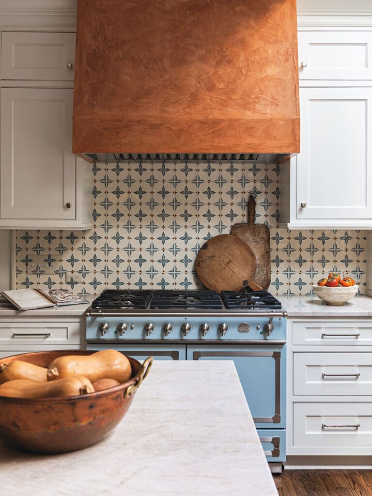
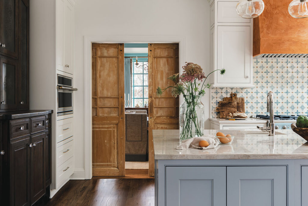
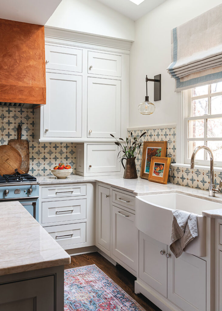
ABOVE: This kitchen embodies the warmth and rustic charm of a French country aesthetic. A La Cornue CornuFé series stove serves as a luxurious focal point for culinary creation, while the vent hood is artfully finished with Venetian plaster for an elegant, textured look. The bespoke cabinetry and the fitted reclaimed doors leading into the dining room showcase the beauty of natural wood and traditional craftsmanship. Muted blue cabinetry brings a subtle pop of color that ties in with the rest of the house. The quartzite countertops add a luxurious touch, their veining complementing the kitchen’s neutral color palette. The space is thoughtfully accented with antique-style hardware and a mix of open and closed storage, harmonizing modern functionality with timeless design elements. The intricate tile work and the use of robust materials create an inviting atmosphere that is both sophisticated and comfortable, reflecting the soul of the French countryside.
Designers are choosing materials that bring warmth into spaces without sacrificing functionality. Exposed wooden beams and other such accents bring a sense of comfort and tradition. Quartzite countertops in kitchens
(a more durable option than quartz) provide hard-wearing yet sophisticated cooking surfaces. This juxtaposition continues into the bathrooms, where free-standing tubs stand against tiles with contrasting colors and textures, creating sanctuaries of relaxation.
Today, interior design trends center around the story of those who live in the home, providing narratives for families that shape the home’s overall character. Designing homes today is about crafting spaces that don’t just follow vogue but also reflect the unique personalities and needs of the inhabitants. In the Wakefalls home’s use of color schemes; its resilient yet elegant materials; and its rustic French charm, which marries comfort with functionality, the house stands as an example to the power of interior design in creating a sense of rest. The end result is a cohesive environment where warmth and personalization are paramount, creating not just a house, but a haven for those who dwell within.
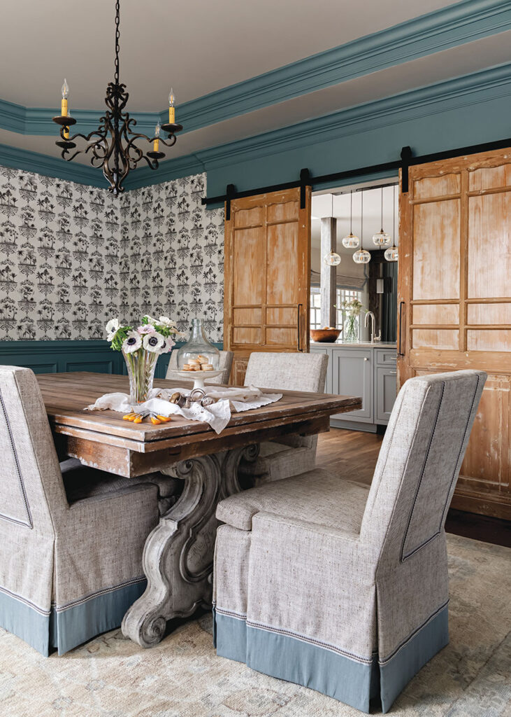
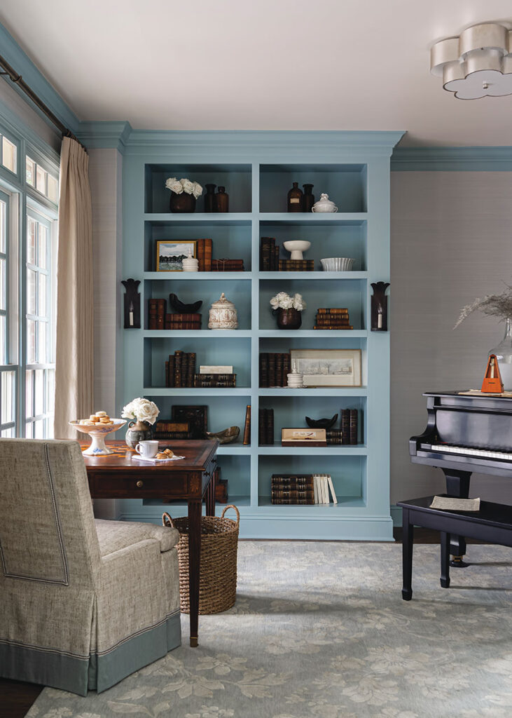
ABOVE: This dining room, with its classic wallpaper and dusty blue accents, offers a seamless transition into the adjacent kitchen, creating a cohesive space that is both graceful and inviting. The traditional wallpaper, featuring a botanical print, compliments the French country aesthetic, while the blue-painted trim and matching drapery frame the room with a pop of color that echoes the kitchen’s cabinetry. The well-curated mix of rustic wooden furniture and refined, upholstered chairs with blue detailing further bridges the aesthetics of warmth and sophistication, harmonizing the Old World charm with contemporary touches.
Built-in shelving, painted in the same dusty blue that flows throughout the home, beautifully complements rich wood accents. The shelves are styled with a collection of vintage books, decorative vases and ornamental pieces that add a personal touch to the space.
Walls that WOW
An inside look at the resurgence of wallpaper—with emerging trends, tips and tricks from two North Carolina–based design mavens.
BY KATELYN RUTT | PHOTOS COURTESY OF COURTNEY MELLOTT
Throughout the decades, walls have stood as canvases for self-expression, embracing a range of trends—from paint to silk, tapestries, mosaics and beyond. We now find ourselves amidst the resounding comeback of an interior design classic: wallpaper. Gone are the days when wallpaper was relegated to floral and vintage patterns; today, it re-emerges as a dynamic and versatile tool that allows designers to break free from traditional constraints. From swirling watercolor hues to daring patterns and personalized murals, wallpaper now has the ability to create spaces filled with harmony that reflect the distinctive and multidimensional essence of those who call them home.
For Courtney Mellott, designer and owner of Courtney Mellott Interiors—a residential interior design firm based in Raleigh—wallpaper is a staple in her design arsenal.
“I love wallpaper,” Mellott says. “I try to always use it at least once or twice in a project. To some clients it can be scary or daunting, but I always say, ‘Let’s start with the powder room. That can be your moment to go a little out of the box or to have fun with some colors you want to incorporate in your home.’ I think wallpaper can really make a space feel special and unique, while also bringing it to life.”
The designer, whose portfolio is brimming with Carolina blue, sea greens and botanicals, is adept at integrating her personal design style with the latest trends. Mellott’s color preferences, specifically within the context of coastal hues, are a seamless fit for the classic and whimsical wallpapers now rising in popularity.
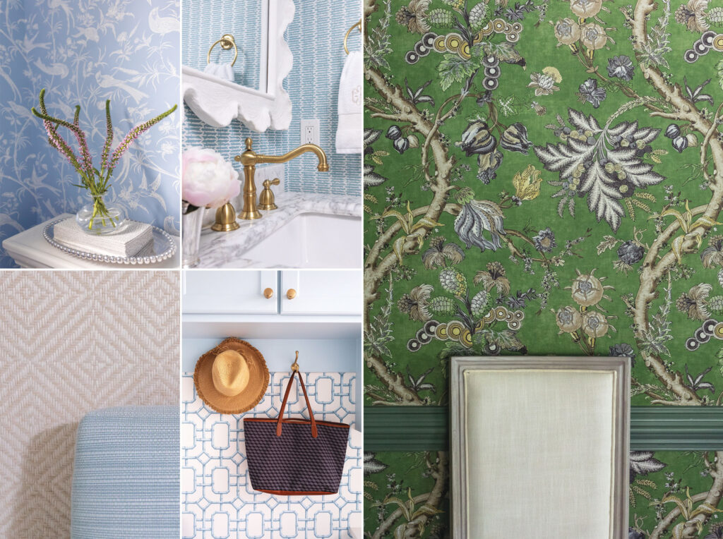
“There will always be plenty of options for blue patterns and colorways, but I think green is really having a moment,” Mellott says. “Whether it be a rich, dark green or a cooler light green, I think we are going to see more greens in wallpapers and fabrics. Hand-blocked fabrics are also popular right now, so there will likely be more wallpapers that mimic those patterns.” Regardless of the ever-changing trends, Mellott grounds her design approach in an enduring appreciation for timeless textures. The designer often turns to grasscloth, appreciating its ability to introduce depth and dimension to living areas. When it comes to darker rooms or navigating low ceilings, Mellott favors textured wallpaper, highlighting its knack for making a space feel larger.
“If I have a client that is ‘wallpaper happy,’ meaning they want to use wallpaper in a lot of places, I start with the largest room first,” Mellott says. “We pick out the design and color scheme and then work our way towards the smaller rooms. I think mixing colors and patterns is a lot of fun, and my advice would be to not pick something completely random. Make sure the colors are incorporated in the room or house somewhere, even if it is a little pop of color.”
Much like Mellott, Rebecca Driggs—principal designer of Rebecca Driggs Interiors, located in Wake Forest—selects wallpapers with intention. Specializing in a warm, modern style for high-end new construction and renovation projects, Driggs adheres to a set of core principles to ensure a consistent appearance throughout each home.
“Use similar tones from room to room,” Driggs says. “Employ complementary colors, vary the scale of patterns, and stay true to your chosen style, whether it’s traditional, modern, or other.”
The designer opts for wallpaper when aiming to elevate a room’s style, and notes a rising client preference toward organic and floral motifs, as well as watercolor detailing. Driggs is known for infusing modern touches into more traditional styles, and skillfully blurs the line between feminine and masculine aesthetics. Her proficiency lies in making visually striking design statements, often utilizing wallpaper to transform powder rooms or applying it over wainscoting in dining areas.
“I’m naturally inclined toward blues, greens and neutrals when it comes to design, and this holds true for my wallpaper preferences,” Driggs says. “Right now I’m particularly drawn to wallpapers that mix either blue or green with an accent color, and my favorite accent is a blush.”
Looking ahead, Driggs foresees custom murals emerging as a key player in the ongoing revitalization of wallpaper due to their ability to express a homeowner’s interests and personality. She emphasizes that opting for bespoke wallpaper “is an excellent choice when aiming to incorporate a particular color, texture or theme into your design.” As wallpaper trends evolve, Driggs anticipates growing alongside them, allowing them to inspire and fuel her creativity as a designer—an invaluable piece of advice for those seeking to embrace this trend in their homes.
“Challenge yourself to step out of your comfort zone,” Driggs says. “The risk will be worth the reward.”
